The onboarding challenge: Getting 600K Capital One customers to actually use expense management
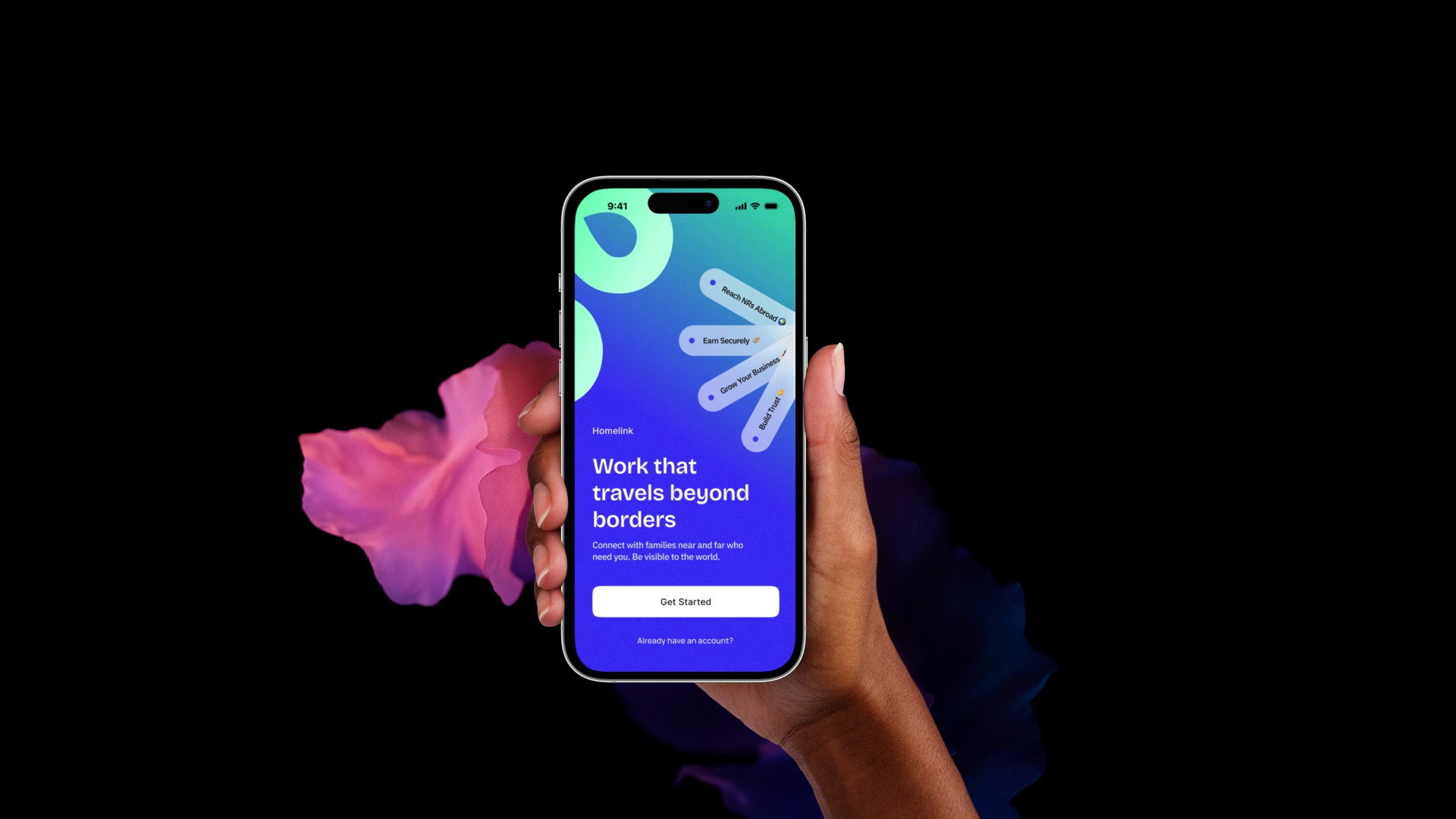
Transforming a 1.5-month nightmare into a 3-minute experience for 600K+ businesses
Client / Company
Fyle & Capital One, USA
My Role
Design Thinking, Flows, Design System, Direction
Category
$4M+ ARR
Year
2024- 25

01
Context
Fyle is a B2B expense management platform, that enables company employees to capture receipts, categorize expenses, and submit them seamlessly for reimbursement or accounting. But after signing up with Fyle, setting up the organisation was a big, painful process for the org stakeholder, as it would move through the implementation team and the conversation would typically last for 1.5 months for an account setup, delaying value realization at both ends.
For onboarding 600K+ users at Capital One, USA, handling the onboarding process manually wasn't a scalable option, and hence the team sought a self-serve onboarding of organisations to its embedded expense management platform powered by Fyle.
This was the origin of this initiative with the following business potential value:
600K+ eligible small business cardholders
$4M+ in Annual Recurring Revenue (realized)
02
Challenges
The major challenges I faced in this initiative were:
Time constraints for both design and development
No involvement of the product team
No access to Capital One's end users
03
Strategy
For successful deliverables within a limited timeframe, I ensured sticking to the following process to understand customer pain points, manage stakeholders effectively, conduct usability testing, and refine designs post usability testing:
In-person interviews with the implementation team
Understanding the existing
Coordination with the data team
Brainstorming sessions with the head of the product team
Design feasibility checks with the engineering team
Stakeholder review sessions with the Capital One Product & Design team
Coordinating with the Capital One team on usability report findings
Delivery of the design system as per Capital One's branding guidelines
All within a span of 2 months — and we were just a 2-member team :)
Key KPI:
At least 60% of test users should successfully complete core onboarding tasks (e.g., invite team, assign card, set default policy) without assistance.
04
Week 01: Calls & Discussions for Insights
The implementation team at Fyle had already onboarded 150+ orgs in the past, hence they were the great source of information to understand
the different org set up patterns
the existing settings that confused the users
and users questions around complex workflows
the user's emotional journey till the set up is complete
The last point helped me define the persona, current customer journey whereas others gave pointers towards the JTBD.
05
Jobs to be done, data points & key flows
The four major common pattern I observed in setting up the org were
Inviting employees
Setting up bare minimum expense policy around receipts
80% of organizations configure expense policies based solely on receipt submission.
35% of those apply a $75 receipt threshold.
Setting up approval process
78% of small organizations use only 1–2 levels of approval, typically Manager to Finance Admin. Of those who set up a secondary approval, 60% do so based on an amount threshold
Setting up integration with accounting
Hence our JTBD was structured around these major steps.
JTBD:
Should be able to onboard employees quickly
Should be able to assign roles and permissions efficiently
Should be able to delegate the setup to another person with ease to manage workload
Should be able to define expense policies and conditions around receipts
Should be able to set up submission rules and timing
Should be able to configure approval workflows
Should be able to integrate accounting tools
Should be able to go live confidently and independently
Key User flow
One of the key design decisions we took in the user flow state was to nudge the user to set up the accounting integration after onboarding, as setting up the integration itself was a 5-step process that could delay the entire onboarding process, defeating our purpose of helping the user go live first.

06
Week 02: Delivering brand aligned Design System as first deliverables
Before we stepped into the design, It was essential for us to set up the white label design system for achieving speed in execution.
I was able to deliver the design system within 2 days as Fyle's design system was token based and intentionally designed to deliver white label offerings faster.:)

07
Week 03: Designing Onboarding through messy Paths
The solution listed below seems simple and clear, but we went through multiple iterations to bring it to this level. The case study does not detail each and every aspect, but rather the major ones.
8.1
Designing onboarding touch point
It was hard for to find a B2B org onboarding references during competition study, and this is what the best thing about the B2B products. We dived deep into various explorations towards the end of week 2.
❌ failed attempt
To reiterate, based on our insights, an admin needs to set up the bare minimum things like
Inviting employees
Assigning roles
Setting up receipt policy
Setting up approval
Setting up expense submission
Our initial strategy was to allow users to finish account setup at their own pace. For basic setups, we decided to take them to the existing settings when the user tried to set up the account. For example, if a user tried to set up employees, they would be redirected to Settings → Employee page. The idea was to reduce engineering effort, which would help us deliver the initiative faster.


But, we hit the roadblocks soon because of following reasons.
Redirecting to settings exposed users to all configurations, many of which were irrelevant or overwhelming during onboarding
The settings architecture was not designed for step-by-step onboarding—causing cognitive load
Redesigning the settings experience to support onboarding would have required significant engineering effort, which was out of scope for this initiative
❌ The attempt to make the failed attempt work
To address the cons, we went ahead with the direction of:
Showing the basic settings
Revealing various functionalities through progressive disclosure
For example, if a user starts with setting up the receipt policy, we introduce that first, hide the rest, and then display other options as the user tries to set up additional things later.
This approach required a huge number of changes in the settings. It was also much more difficult to decide on the progressive disclosure flow across pages. It involved significantly more work from both the design and development teams.
✅ Taking U-turn : Guided Setup Before Product Exploration ~ The Sequential Navigation
While giving the user control to finish onboarding at their own pace while exploring other parts of the product was a good approach, it didn't work well in our context. Hence, we were forced to think through a completely different approach as time was ticking.
In Week 04, we tried the approach of asking the user to complete the org setup first before exploring the product, while still allowing them to skip various steps so they wouldn’t feel forced.

In our internal usability testing and discussions with various stakeholders including Capital One, We observed this approach was simple and gave a highly focused and streamlined user experience for onboarding.
8.2
Allocating the function between user and technology: Smart Defaults for Quick Set up
Since we offered the Skip option for flexibility to give user the control, without having some basic set up, it was impossible to allow spenders to onboard and start submitting expenses.
Hence we decided to introduce defaults in major paths, wherever possible, reducing user work, increasing user's confidence. I would touch these defaults as we go through individual onboarding steps.
8.2.1
Inviting Employees
❌ failed idea
Traditionally, Fyle offers an excel based import for inviting employees on bulk. Bulk adding employees is a sensible approach when the org owner deals with 50+ employees. At Capital one, the targeted orgs were small org owner ranging 5 to 20 employees.
An excel based work would have overwhelmed the Admin and if admin failed to upload the excel file in certain file, it was tricky for them to fix those without support.
Hence our initial approach was
Allow finance admin to manually update the employees which was time consuming
or, import employees from Capital One Ease portal to Embedded expense Management platform
✅
The import option worked beautifully for us. To take it further, we imported all employees with the "Spender" role to reduce the finance admin's work. The reasoning was that in a small org, there were typically a maximum of 2 to 3 admins— and in the majority of cases, a single admin managed the entire org.

Compared to Fyle's traditional employee invite process, the embedded employee invite was much faster and required just one click.
8.2.2
Receipt Settings
Fyle's receipt setting was part of a very complex policy page set up. Hence bringing the entire policy page did not make sense. The page demanded a new structure that the engg team needed to build. This trade off was intentional.
The UI was kept simple to build it quickly.

8.2.3
Approval Workflow
Similar as Receipt Settings, Approval workflow was part of the policy set up and it was hard to set this up without support teams help.
Our major challenge for this screen was leveraging the existing tech to provide a superior experience without using complex structure to implement.
❌ failed attempt
The primary goal of the page was
Setting up approval stage
Setting up approvers for employees

✅ What worked
Assigning admin as the default approver
Simplified presentation for adding 2nd stage approver

8.2.4
Expense Submission Scheduling
This was straight forward one and a replica of what Fyle's core product has.

8.2.5
And more..
I'm wrapping it here.
By week 4, we were able to hand it off to the Capital One team who further carried out the usability testing and shared the report with us.
Some of the users struggled with a few terminologies like expense reports, some blindly went ahead ahead with defaults.
So sometimes too many defaults can lead us to the above behaviour :D
We tackled the findings in a phased manner. But most importantly. we hit our KPIs set for the usability stage. ✅
Impacts
We kept tracking the data points in next 3 to 6 months and found the onboarding time was drastically reduced under 3min.