Empowering Designers through Design System leveraging design tokens, properties & more
Helping designers ship white-label design systems faster, including data grids, preparing various versions of components through a powerful component panel, and more.
Client / Company
Fyle
My Role
Internal Research, Thinking, System building, Usability testing
Category
Designing a system
Year
2023

01
Product Context
Fyle streamlines end-to-end business expense management—from capturing receipts and creating expenses to seamlessly syncing them with accounting systems—all powered by AI.
02
Problems
When I joined Fyle as a Senior Designer, I built the first basic version of the design system in Sketch. Later, a teammate migrated it to Figma—by then, I was leading the design team.
During design reviews, I noticed that almost all designers were struggling with similar issues. Driven by curiosity, I initiated one-on-one conversations and discovered several underlying problems with the existing design system that were directly affecting project delivery.
The major issues were
Designers frequently detached components
Due to the lack of a properties panel and a flexible layout structure, designers were often compelled to detach components to make basic changes. This led to inconsistency and inefficiency—100% of designers reported facing this issue.
Creating data grids was painful
Since 90% of the product consisted of data grids, almost every design initiative involved working with them. However, the absence of a well-defined system made creating and maintaining data grids overwhelming. Designers often spent 20–30 minutes just managing grid elements within a single design, which negatively impacted delivery timelines.
Missing components created inefficiencies
Junior designers regularly struggled to find specific components in the system. As a result, they often recreated components from scratch, which later had to be revised or rebuilt during design reviews—adding friction to the workflow.
White-labeled design system was hard to scale
Creating white-labeled versions of the product was tedious. Changing style tokens alone wasn’t enough—some brands required different spacing rules or component-level tweaks. Without a scalable system, each design file had to be manually adjusted, making the process repetitive, time-consuming, and frustrating for the team.
03
Solving Problems
3.1
Defining Tokens
A basic UI element has atomic label specifications
Color
Typogrpahy
Spacing
While the old design system had basic style defined, but the specification was missing at components label. As part of this initiative, I made the entire system token based.

3.2
Enhancing layout efficiency
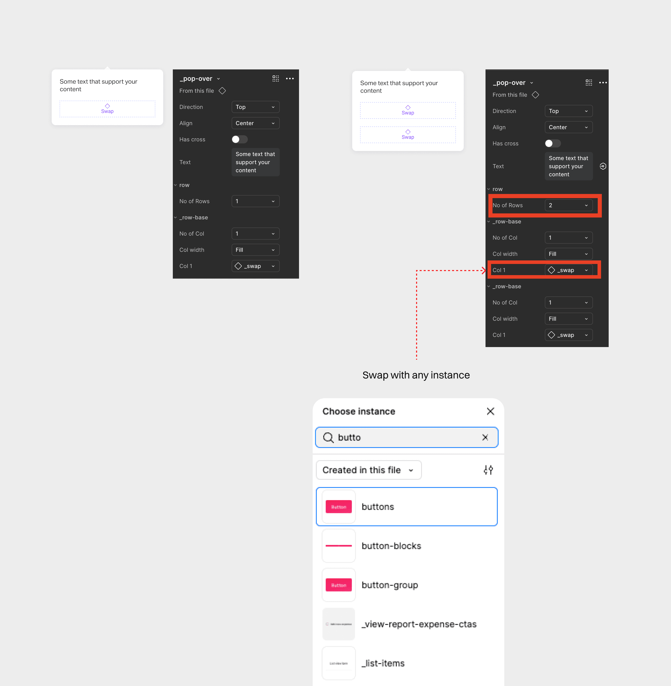
Nailing this part was a little crazy :D. Somehow was able to pull it off via component swap and the layout width and height would adjust automatically.
Enables designers to convert a parent swap element into a customizable grid of rows and columns.
Allows seamless swapping of any row or column with a desired component using the "Choose Instance" option.
It reduces the need of detaching the components quite remarkably. There was no way to measure this, but designers reported the % of detaching the element was reduced.
3.3
Creating Data Grids Super fast
🚫 failed idea
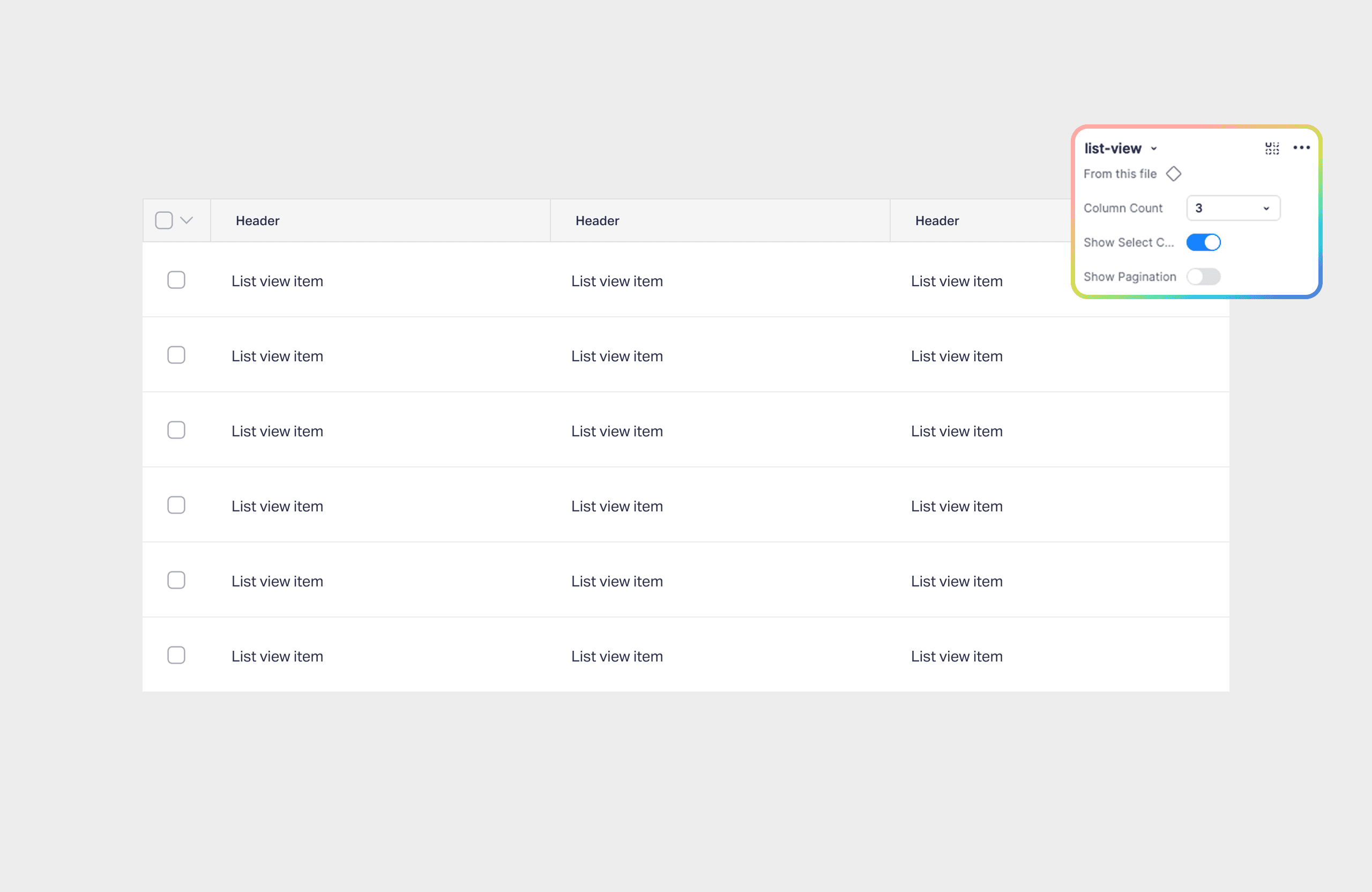
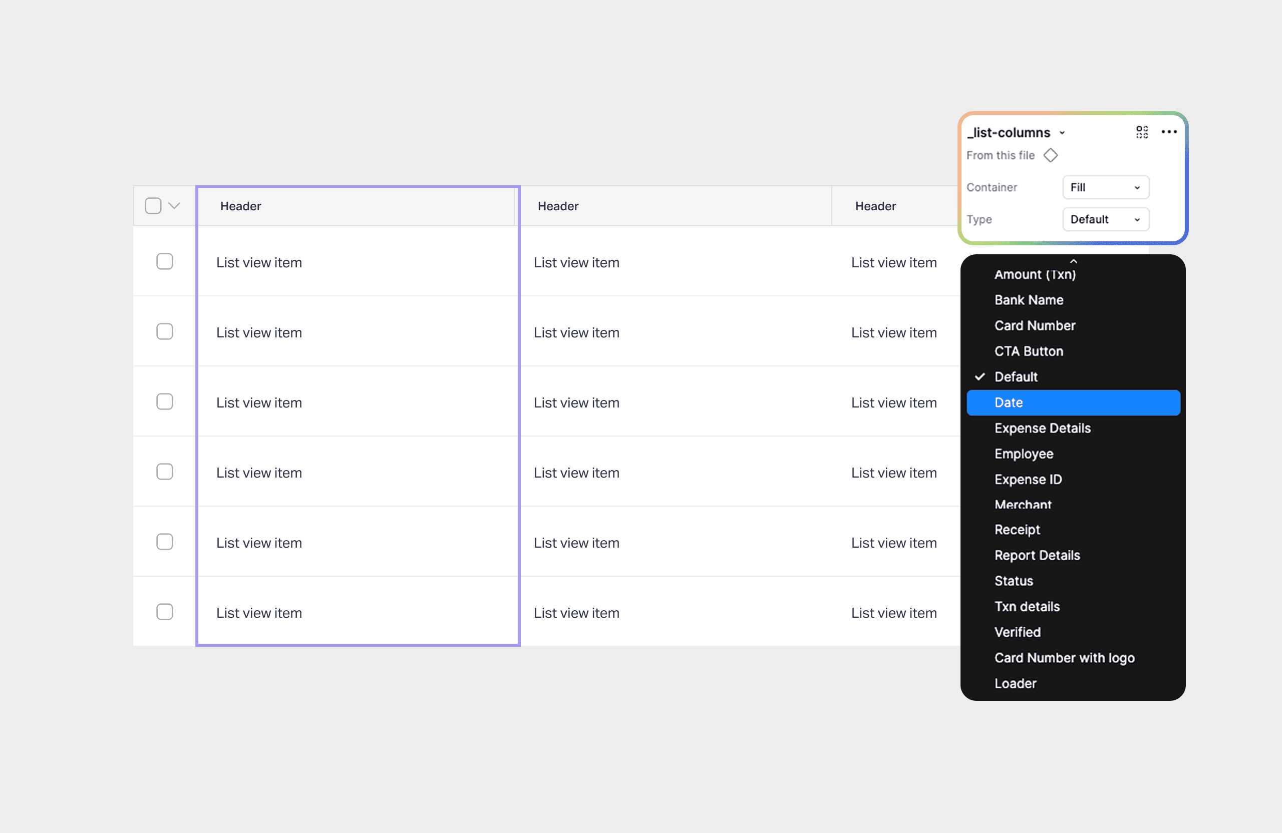
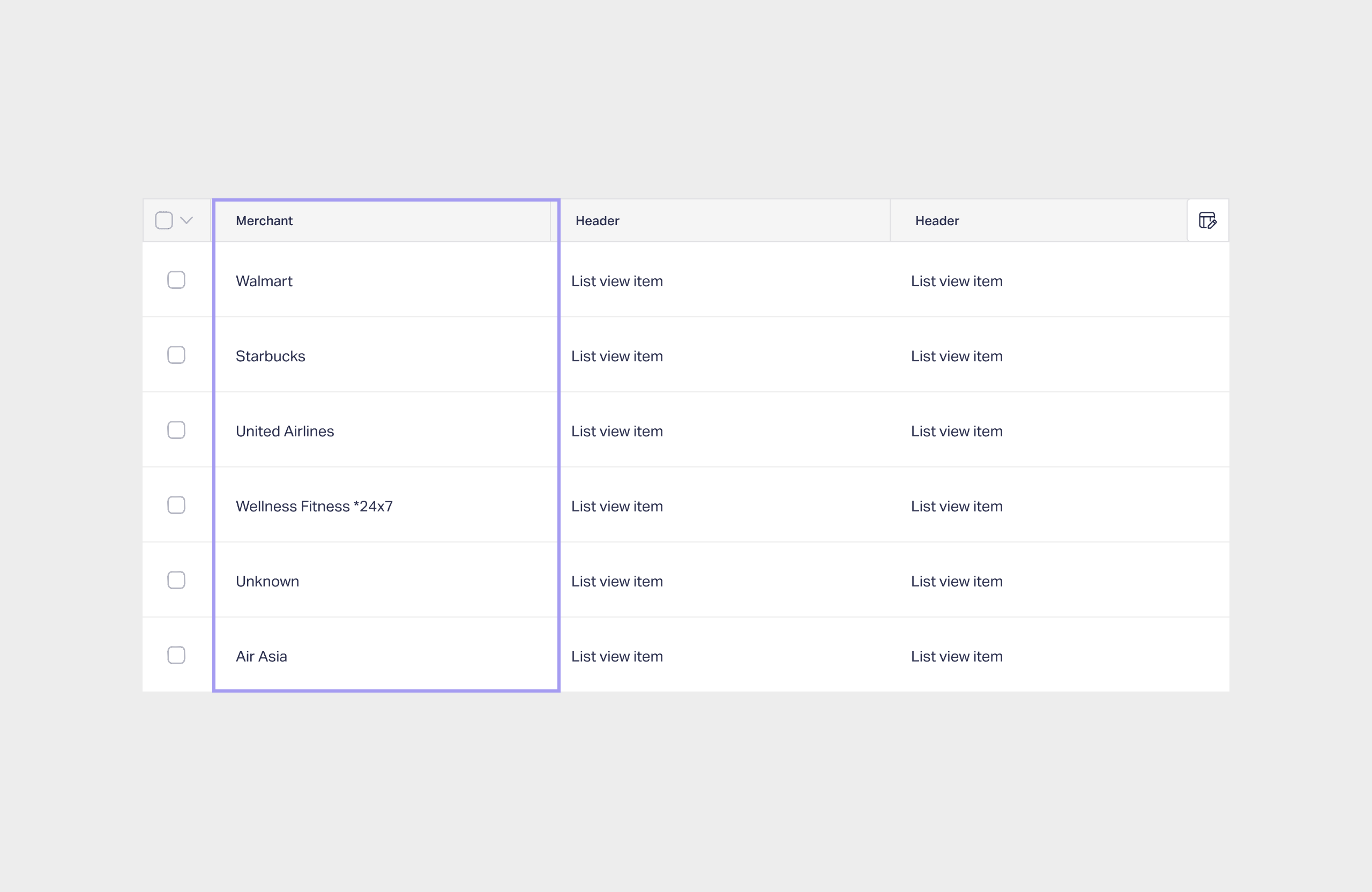
A typical dat grid consist of row wise and it make sense to approach it this way. Considering the number of types of columns the product had, we found the row wise attempt would not work.
✅ What worked
We approached the data grid column wise.
Our new list view structure enabled designer
to quickly search for it
define the number of columns via properties
select column types
adjust the width from fill or hug or contain
3.4
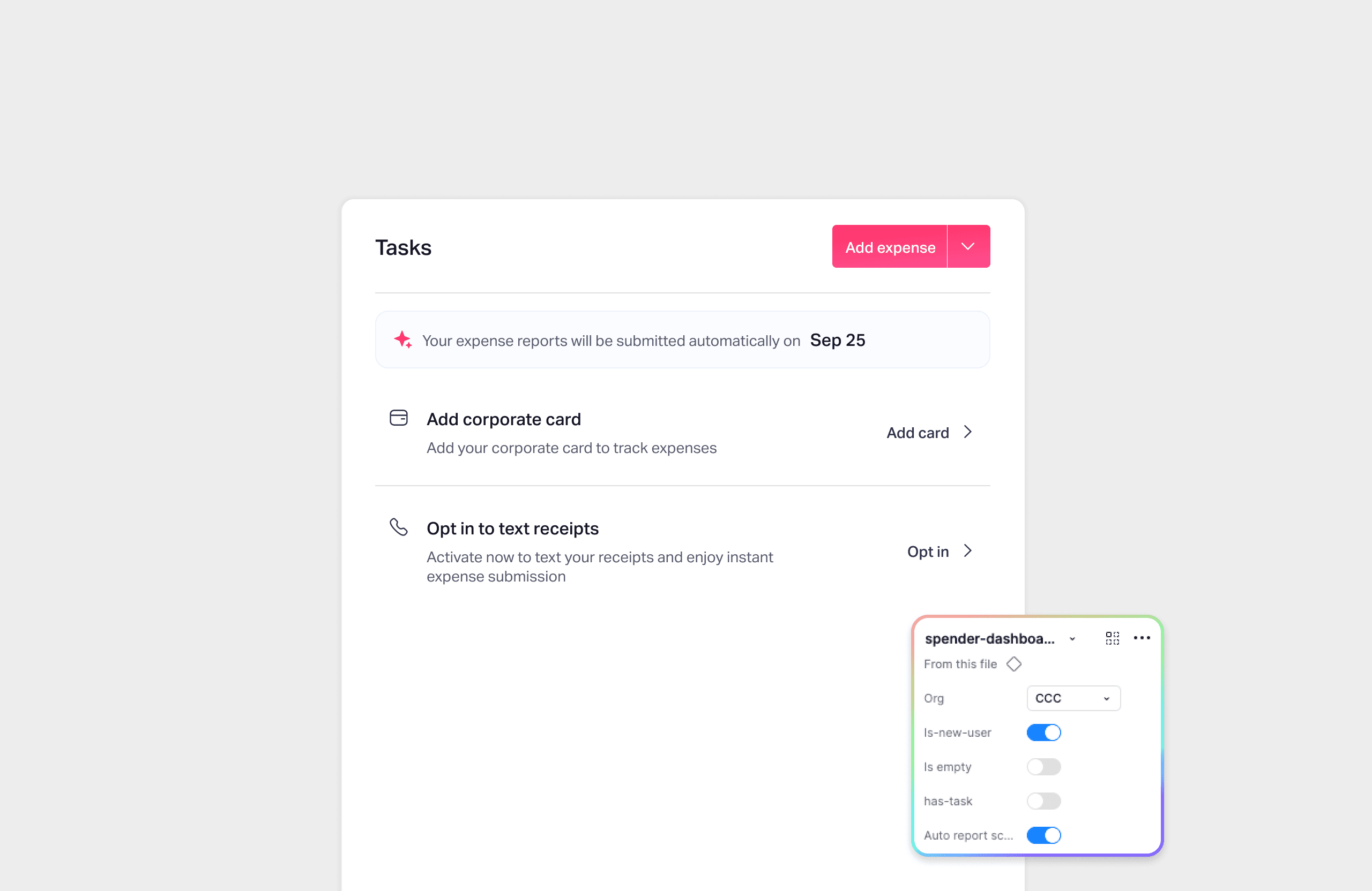
Introducing Page specific Components with Org-Specific Variations
Fyle, as a product, was filled with various edge cases because of 3 org structures e.g Corporate card org only, reimbursable org only, and mix of both.
The newer folks faced problems in understanding various edge cases and was heavily dependent on devs. In order to reduce this, we introduced page specific component variation.
3.5
And more…
These were a few major problems that I solved in initial phase. Later on, team member joined to refine it further.

